Building web pages with Shopify has lately become more popular among e-commerce merchants. But are you curious about how successful brands have developed their websites that bring lots of effectiveness?
In this article, we have proposed a list of model Shopify pages that worked well and had certain positive impacts on the online presence of the brand. But first, let us go through some basic knowledge about Shopify.
What is Shopify?
Shopify is a friendly e-commerce platform where businesses can create and grow their online presence while still having full control over it. With the solid proof of millions of testimonials having gained success on this platform, it is safe to say that Shopify is not only empowering the e-commerce trend now but also shaping what the whole industry looks like in the future.
How does Shopify work?
Shopify plays as the ultimate all-in-one platform: whatever you need for your stunning, convenient, and profitable online store, Shopify can meet them all.
- Shopify can help create and customize online stores
Are you sick of those ordinary and boring web pages that somehow are not effective at all for gaining sales on different channels? Then you don’t have to be worried anymore. Shopify offers merchants well-customized online stores, helping them attract more revenue from multiple places: their websites, mobile devices, social media channels, marketplaces, and more.
- Shopify allows merchants to access and manage their business from any connected compatible device
Using Shopify as your store management tool, you can keep complete track of your business from anywhere and at any time. Shopify gives you the right to get access to your business information from any compatible device that has been connected to the system before. The game is all yours now since you can operate your store from anywhere with an internet connection.
- Shopify users can integrate other tools to leverage their businesses
Whatever additional tools you need to manage the store’s inventory, shipping condition, or revenues earned, Shopify can help. All these tools are integrated so that merchants can manage anything about their business via the one-and-only Shopify platform.
Which sales channels are created with Shopify?
The omnichannel sales reach of Shopify is broad. The platform provides certain built-in sales channels, including an online store, popular social media channels, and POS. Also, other sales channels, such as seller marketplaces, in-app purchases, and online courses, can be linked with Shopify apps as well.
Below is a list of a few sales channels that Shopify can connect you with:
- Shopify online store
- Social media sites: Facebook, Instagram, Pinterest, WhatsApp, TikTok,…
- Seller marketplaces: Amazon, Walmart, eBay, Etsy,…
- Non-Shopify websites and blogs: Operate through the Shopify’s Buy Button embedded
- Branded mobile app
- Email and chat

Which elements make an effective website?
It can be said that a website is a must-have item for any successful business and should be prepared efficiently if merchants want to earn customers’ attention and generate more sales.
But how should we build these websites effectively? How can we know a website is qualified and good enough for our businesses?
Here are some criteria you can use as a checklist if you ever want to test the efficiency of your website.
A responsive and up-to-date design
If your website is appropriately designed, it will be convenient for customers to browse and read on smaller devices. This element of a website is crucial since an increasing number of users surf the internet on their smartphones and tablets. Hence, your website should make it simple for users to transfer between devices without losing their data.
A helpful navigation
Make sure that each link points to the correct page by organizing your site map logically. Visitors will lose interest in or get annoyed with your website as a result of broken links or buttons that send them in the wrong direction.
A strong brand identity
Color scheme, font, photo types, tone of voice, and brand message should all be taken into account. These elements all work together to create a unified brand image that tells visitors who you are without saying anything. Your visitors will be unlikely to attach themselves to your business if your brand identity is unclear.
High-quality content
Search engines always scan websites for legible, valuable, and frequently updated materials, so make sure to offer interesting, practical, and educational material on every page of your website.
Clear Call-To-Actions
Making it clear what you want your site visitors to accomplish will help you guide them and clear up any confusion. Use a strong and urgent tone of voice, and you will make it.
Security features
Always let visitors know that any information they share with you is secure and that it will only be used for the original purposes without being sold afterward.
Shopify Website Examples
Here is a collection of motivational Shopify stores that may be used as examples for those who are starting their businesses.
1. Hiut Denim Co.
Hiut Denim is located in Cardigan, Wales, which was also the location of the largest jeans manufacturing facility in the UK until 2002. Hiut Denim was established in 2011, inheriting the knowledge and expertise in jean-making, displaying a commitment to craftsmanship, and bringing production back to Cardigan.
Hiut Denim was successful to build its homepage with such simple but clear navigation. Each section in the overall category tells exactly where customers will go afterward: Men zone, Women zone, or other non-denim stuff. This Shopify website has a simple, not wordy, but effective layout and really makes a strong brand impression: they only care about producing the most fantastic jeans in the world.
2. Ketnipz
Founded by Harry Hambley, a cartoonist, Ketnipz is a clothing merchant that sells fabric along with funny and cute cartoon characters. Along with the financial demands, Ketnipz has a strong willingness to use the business model as a method to have great impacts on the environment.
The most impressive part of Ketnipz’s website is definitely its overall design filled with cartoon characters and other lovely elements. With a unified color scheme, matching text fonts with animations, and those adorable character images, Ketnipz is a brilliant example of how to generate a website with a strong brand identity.
3. Tentree
Dave Luba and Kalen Emsley started Tentree, a clothing brand, as a way to make use of their business to have a positive impact on the environment after spending time living in Hawaii. Tentree commits to planting 10 trees for each product they sell, and by 2030 they hope to have planted over a billion trees. This is one of the top Shopify stores that is ethically motivated.
Tentree is another model website showing an effective method to make customers fully absorb its brand message. With nearly half of the homepage filled with photos and stories about its tree-planting journey, the consistency in Tentree’s brand image has been perfectly crafted.
4. Adored Vintage
One of the top Shopify stores, Adored Vintage, sells vintage apparel as well as contemporary items with a vintage aesthetic. Rodellee Bas, the shop’s owner, draws inspiration for her selections and original works from her love of historical patterns. In addition, Adored Vintage provides a portion of its profits to the local schools.
The website feels like a virtual vacation in the gorgeous French countryside, which shows the success of the brand owner in bringing vintage vibes to every corner of the page. In addition, the homepage is arranged carefully and effectively with reachable segments: dresses, accessories, Atèlëtte,… This will help navigate the guests and generate sales more easily as a result.
5. Chao Cards
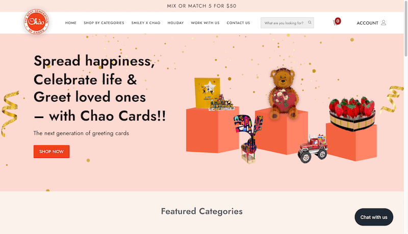
This is a lovely brand selling greeting cards with such a playful spirit spread through its whole website as well as its products. Chao Cards handcrafts and sells a large selection of motivational, 3D pop-up greeting cards for any occasion.
The stunning homepage, with brilliant color use and unique CSS, definitely makes Chao Cards stand out. Coming with an amazing layout and its availability on several devices other than desktops, Chao Cards has well demonstrated how a website should possess responsive and up-to-date design.
6. Alumi Studio
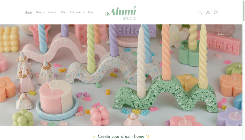
Founded in 2021 by Milena, a beautiful young lady, Alumi Studio has become the place where its founder shows her passion for creating colorful, useful, and eco-friendly candles.
With the engaging candle-making tutorials posted on the homepage, Alumi Studio has been successful in spreading its core strength of making customized, handmade, and unique products for anyone who needs a nice treat for themselves. Moreover, the clear and inspiring Call To Action messages delivered throughout the entire homepage: “Create your dream home”, “Join us in the joy of color!”, ”Customize it!”,… have worked perfectly for Alumi Studio.
7. Charlesbridge
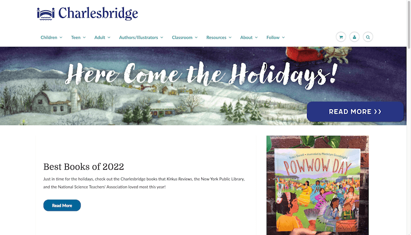
Charlesbridge, a children’s book publisher, provides kids with wonderful books in an attempt to support lifelong readers and learners. They think that books for kids should convey correct knowledge, maintain a positive perspective, and encourage a kid’s natural sense of wonder and fun.
By providing a book collection in a three-column format with large photos on the website, Charlesbridge has proved the phrase “simple is the best”. Additionally, the perfect navigation on Charlesbridge’s product page has made it easier than ever for customers to teleport to any section provided: Children, Teens, Adults, and Classrooms,…
8. Black Rhino-x
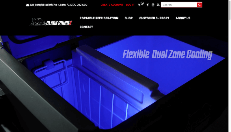
Black Rhino-x offers camping appliances that are produced using fewer resources, reducing waste, and releasing fewer emissions. While continuing to meet its financial demands, Black Rhinox wants to minimize any adverse effects on the environment.
All the photos, video clips, text font, and brand messages on the web page have been delivered with a consistent professional vibe, making a solid brand image that Black Rhino-x focuses on bringing the most convenient experience to campers, while still showing a deep connection with nature and the environment.
9. Kulala Sleep Lamp
The Kulala Sleep Lamp is the one-and-only product line from this e-commerce brand. Thanks to smart lighting and melatonin from nature, this technology is supposed to help people sleep well. The lamp and related software were developed by its founder and sleep researcher, Dr. Sofia Axelrod.
Bringing a soft and “sleepy” vibe throughout the page is one of the biggest achievements of this website. The colors, the writing tone, and the animations have become a harmony showing how effective this product line might be. Also, the great structure of the Kulala Sleep Lamp site still looks amazing on different devices, which turns out to be another strong point detected here: responsive design.
10. Cowboy
Cowboy uses top-notch video and images on its homepage and across the rest of the website to offer intelligent e-bikes through its Shopify store. Users can also schedule a test ride to use the goods before making a purchase, which is a wise strategy for a product with such a high price level.
All the special effects, animations, photos, text font, and tone of messages have been delivered smoothly and steadily on Cowboy’s website. Nothing else can be witnessed on this homepage except modern vibes and the feeling of convenience served with those intelligent products from Cowboy.
11. United By Blue
United By Blue recovers one pound of trash from the oceans and rivers for each product it sells. Brian Linton developed this clothing and home goods firm that integrates sustainability into every aspect of its business. United by Blue’s goal is to eliminate the use of single-use plastics such as plastic tape, bubble wrap sleeves, and poly bags.
Along with the series of ethical brands on Shopify, United By Blue has convinced people with its sustainable-growth strategy through the consistency found on the web page. Not only the inspiring messages but also the images of environmental issues on the website have built a strong identification of the brand.
12. Flourist
Flourist sells freshly made, 100% traceable flours and dry foods and has pages on its website dedicated to highlighting the farmers it works with. Baking fans will find this website to be a paradise as sourcing ingredients from Flourist explores the distinction between freshly milled flours and heritage grains.
The way Flourist displays each of its grains, beans, and freshly milled flours on the homepage is like a lovely flower shop. In this case, the brand has been successful in expressing an organic vibe throughout the pages. Plus, the practical and educational materials that Flourist brought, including recipes, ingredients, and tutorials, are the key to making this brand’s pages shine by applying high-quality content.
Tapita Landing Page Builder – Create your landing page, product page, blog page, and more
Among the listed model website examples above, Chao Cards, Alumi Studio, Charlesbridge, and Black Rhino-x have been built using Tapita Landing Page Builder. Undoubtedly, this is a wonderful app that any business owner will not want to miss if they desire to build a stunning and effective web page for their brand.
With Tapita, anyone with no coding experience can quickly and easily design stunning websites, landing pages, product/collection pages, and blog pages for themselves. You don’t need to create your sites from scratch because Tapita offers an extensive library of page and block templates with fantastic layouts and effects. By using customized and attractive pages, your brand website will carry a positive impression to better convert people into consumers.
You will receive free assistance from professionals as you build your pages with Tapita. There is no more reason to hesitate, right?
With Tapita you can:
- Choose from more than 70 gorgeous page templates or design your own
- Translate your pages into several languages automatically
- Receive the aid to customize HTML, CSS, and Javascript for developers and experienced users
- Import and export Tapita’s pages to backup or transfer among accounts
- Save your segments for future use
Are you excited about the upcoming journey of your business?
If the answer is yes, then you should keep your eyes on the website from now on, and make it shine.

