
As an e-commerce business owner, you understand the importance of optimizing your website for conversions. One of the most crucial aspects of a successful online store is the landing page. The landing page is where your potential customers first arrive when clicking on your ads or searching for your products. It’s where you have the opportunity to showcase your products, build trust, and persuade visitors to make a purchase. In this article, we will explore 12 Shopify landing page examples and discuss how you can optimize your landing page for maximum conversion rates.
Benefits of a Shopify landing page
A Shopify landing page can be an essential tool for any e-commerce business. It’s the first impression that potential customers have of your business, and it’s where you can make or break the sale. There are numerous benefits to having a Shopify landing page, including:
Increased conversion rates
The main purpose of a landing page is to persuade visitors to take a specific action, such as making a purchase or signing up for a newsletter. By creating a landing page that is optimized for conversions, you can increase your chances of turning visitors into customers.
Improved user experience
A well-designed landing page can improve the user experience for your visitors. By creating a clear and organized layout, using high-quality images and videos, and including social proof and a clear call-to-action, you can make it easy for visitors to find what they are looking for and take action.
Better targeting
By creating a landing page that is specific to a particular product or service, you can target your audience more effectively. This can lead to higher conversion rates and a lower bounce rate.
Cost-effective
A landing page is a cost-effective way to drive traffic to your website and increase your conversion rates. By using targeted advertising, you can direct traffic to your landing page and optimize it for conversions, which can result in a higher ROI.
Better data collection
A landing page can be an excellent way to collect data about your potential customers. By including a sign-up form or a survey on your landing page, you can collect valuable information about your target audience, which can help you to improve your marketing strategies and increase your conversion rates.
Tips for creating a high-converting Shopify landing page
Creating a Shopify landing page can be an effective way to increase sales and conversions for your e-commerce business. However, there are some best practices that you should follow to ensure that your landing page is effective and drives results. Here are some additional tips to consider.
- Define your target audience: Understanding your target audience is essential for creating a landing page that resonates with your customers. Consider their needs, preferences, and pain points, and tailor your messaging and visuals accordingly.
- Write clear and concise headlines: Your headlines should be clear and concise, and clearly communicate the benefit of your product or service. Use attention-grabbing language and make sure that your headlines are easy to read.
- Use compelling visuals: Visuals can be a powerful tool for engaging visitors and increasing conversions. Use high-quality images and videos that showcase your product or service, and use them to highlight the benefits that your customers will receive.
- Keep the layout simple and easy to navigate: Your landing page should be easy to navigate and should guide visitors towards your call-to-action. Use a simple layout that is easy to scan, and make sure that your call-to-action is prominently displayed.
- Include a clear Call-to-Action: Your call-to-action should be clear and concise, and should tell visitors exactly what you want them to do. Use action-oriented language, and make sure that your call-to-action is prominently displayed and easy to find.
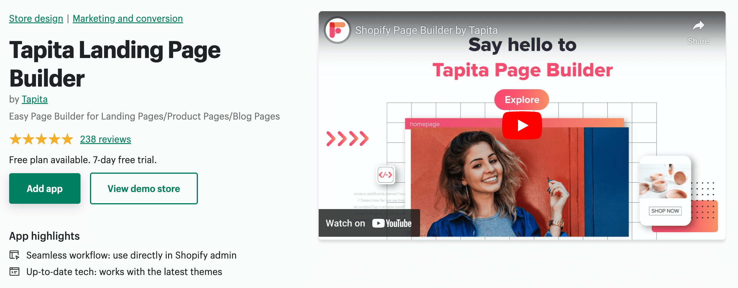
- Use ready-made templates: An easy way to create a stunning landing page is to use beautiful ready-made templates provided by a Shopify page builder such as Tapita Page Builder.
By following these best practices, you can create a Shopify landing page that is effective and drives results for your e-commerce business. Remember to define your target audience, write clear and concise headlines, use compelling visuals, keep the layout simple and easy to navigate, and include a clear call-to-action. With these tips in mind, you can create a landing page that converts visitors into customers and helps you grow your business.
12 Shopify landing page examples to optimize your e-commerce site
1. MVMT
MVMT is a popular e-commerce brand that sells trendy and affordable watches and accessories. Their Shopify landing page is a great example of how to create a landing page that is both visually appealing and effective at driving conversions.
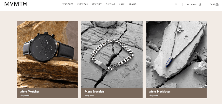
Here are some of the key elements of their landing page:
- Compelling Hero Image: The hero image at the top of the landing page features a high-quality image of a watch, with a simple and clear headline that communicates the benefit of the product.
- Use of Video: MVMT uses a video on their landing page to showcase the benefits and features of their watches. The video is high-quality and engaging, and helps to build trust and credibility with potential customers.
- Product Carousel: The landing page features a carousel of products that allows visitors to easily browse through different products and collections. The carousel is easy to navigate and features clear images and concise product descriptions.
- Social Proof: MVMT includes social proof on their landing page in the form of customer reviews and ratings. This helps to build trust with potential customers and provides social proof of the quality of their products.
- Clear Call-to-Action: The landing page features a clear call-to-action that encourages visitors to shop now. The call-to-action is prominently displayed and easy to find, making it easy for visitors to take action and make a purchase.
Overall, the MVMT landing page is a great example of how to create a landing page that is visually appealing, easy to navigate, and effective at driving conversions. By incorporating compelling visuals, clear and concise headlines, social proof, and a clear call-to-action, MVMT is able to create a landing page that engages visitors and encourages them to take action.
2. The Ridge
The Ridge is a brand that sells minimalist and slim wallets, phone cases, and other everyday carry items. It is a high-converting Shopify landing page that focuses on the unique features of their products.
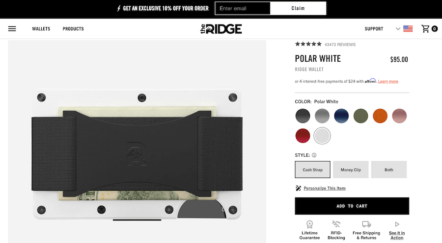
Visual Design
The first thing that stands out about The Ridge’s landing page is its visual design. The page uses high-quality images and videos to showcase the products in action. The images are sleek and minimalist, which aligns with the brand’s overall aesthetic.
Product Features
The Ridge’s landing page focuses on the key features of their products. For example, their wallets are slim and minimalist, but they still have plenty of room for cards and cash. The page highlights the RFID-blocking technology used in their wallets, which helps protect users from credit card fraud.
Social Proof
The Ridge’s landing page also includes plenty of social proof. The page features customer reviews and testimonials, which help build trust with potential customers. The brand also offers a 45-day return policy, which shows that they stand behind their products.
Clear Call-to-Action
Finally, The Ridge’s landing page includes a clear call-to-action. The page encourages visitors to “Shop Now” and offers free shipping on orders over $40. The call-to-action is prominently displayed and encourages visitors to take action.
3. Misen
Misen is a brand that specializes in high-quality kitchen tools and cookware. Their Shopify landing page is a great example of a well-designed and user-friendly e-commerce website.
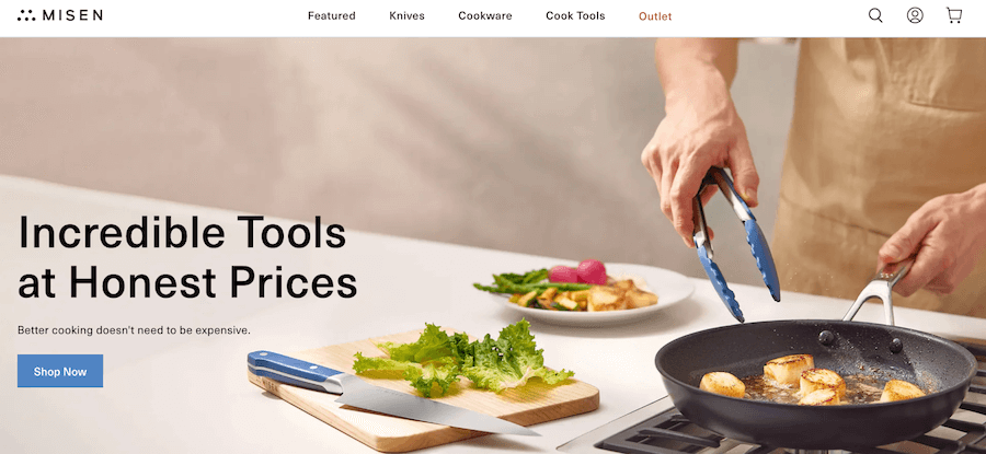
Clean and Minimalist Design
The first thing you’ll notice about Misen’s landing page is its clean and minimalist design. The page features a simple and easy-to-navigate layout that allows visitors to quickly find what they’re looking for. The page also features high-quality images of their products, which helps to showcase their quality.
Clear Value Proposition
Misen’s landing page also features a clear value proposition. The brand offers high-quality kitchen tools at an affordable price, and the page highlights this by using bold and prominent text. This helps to communicate to potential customers why they should choose Misen over the competition.
Product Features and Benefits
Another key element of Misen’s landing page is its focus on product features and benefits. The page highlights the unique features of their products, such as their non-stick coating and ergonomic handles. The page also explains the benefits of these features, such as easy cleaning and comfortable use.
User Reviews and Testimonials
Misen’s landing page also features user reviews and testimonials. These help to build trust with potential customers by showing them that others have had positive experiences with the brand’s products. This is particularly important for e-commerce websites, as customers often rely on the opinions of others when making purchasing decisions.
4. Pura Vida Bracelets
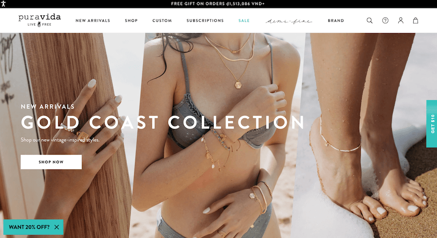
Pura Vida Bracelets is a jewelry company that specializes in handmade bracelets, rings, necklaces, and other accessories. These are some key elements of Pura Vida Bracelets.
- High-quality images: The Pura Vida Bracelets landing page uses high-quality images to showcase their products. The images are colorful and vibrant, and they show the bracelets in different combinations and styles. The images help visitors visualize what the products will look like on their own wrists.
- Call-to-Action (CTA): The CTA of the Pura Vida Bracelets landing page is “Shop Now.” This CTA is prominently displayed in a bright yellow color that stands out from the rest of the page. It clearly communicates the action that visitors should take next.
- Simple form: The Pura Vida Bracelets landing page using discount forms for lead generation to collect visitors’ information. They are simple and easy to fill out, with only the necessary fields.
- Social Proof: The Pura Vida Bracelets landing page uses social proof in the form of customer reviews. The reviews are prominently displayed on the page, and they help build credibility and trust with visitors. The reviews are also accompanied by photos of customers wearing the bracelets, which helps visitors see how the products look in real life.
5. Leesa
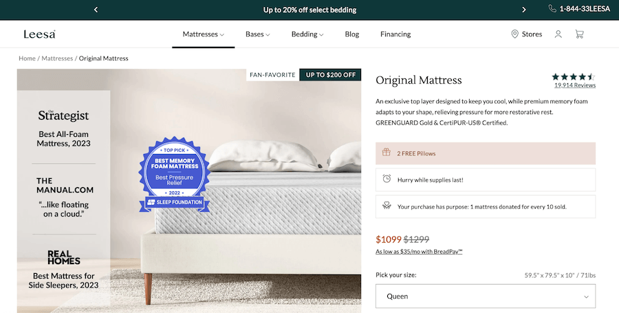
Leesa is an online mattress store that has been praised for its innovative and stylish approach to e-commerce. The company’s landing page is a great example of how to create an effective Shopify landing page that converts visitors into customers.
- Trust Signals: To build trust with potential customers, it’s important to include trust signals on your landing page. Leesa’s landing page features several trust signals, including customer reviews and ratings, awards and recognition, and a money-back guarantee.
- Persuasive Product Descriptions: The product description is another key element of a successful landing page. Leesa’s landing page features a persuasive product description that highlights the benefits of the mattress, such as its cooling properties and pressure relief technology. The description is concise and easy to read, making it more likely that visitors will take action and make a purchase.
- User-Friendly Navigation: The navigation of your landing page should be intuitive and user-friendly, making it easy for visitors to find what they’re looking for. Leesa’s landing page features a simple and straightforward navigation menu that allows visitors to easily explore the different sections of the page.
- Clear Value Proposition: Your landing page should clearly communicate the value proposition of your product or service. Leesa’s landing page does this by highlighting the key features and benefits of the mattress, such as its comfort and support.
6. ThirdLove
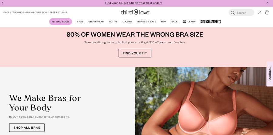
ThirdLove, an online lingerie retailer, has a well-designed Shopify landing page that effectively communicates its brand message and showcases its products.
- Hero Section: The hero section of the ThirdLove landing page is eye-catching and engaging. The background features a high-quality image of a model wearing one of their bras, along with a call-to-action (CTA) button inviting visitors to “Find your fit.” The messaging is clear, concise, and impactful, immediately communicating the brand’s value proposition.
- Product Showcase: The product showcase section of the ThirdLove landing page is well-designed and engaging. It features high-quality images of their products, along with a brief description and a CTA button inviting visitors to “Shop Now.” The products are arranged in a grid format, making it easy for visitors to browse and compare different options.
- Navigation Bar: The navigation bar of the ThirdLove landing page is clean and easy to use. It includes a search bar, links to various product categories, and a CTA button inviting visitors to take the fit finder quiz. The navigation bar is essential for providing visitors with quick access to the information they need to make informed purchase decisions.
The ThirdLove Shopify landing page effectively showcases the brand’s products and communicates their value proposition. By incorporating these key elements into their landing page design, ThirdLove has created a highly effective eCommerce platform that drives sales and increases customer engagement.
7. Rothy’s
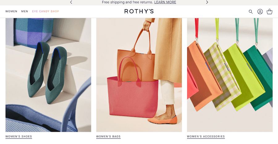
Rothy’s is a popular footwear brand that has made a name for itself with its sustainable practices and comfortable designs. It features a clear and organized product display, prominent call-to-action buttons, and a strong sustainability message.
- Hero Banner: The hero banner is the first thing that visitors see when they arrive at Rothy’s landing page. It features a large, high-quality image that showcases the brand’s products and sustainability messaging. The banner also includes a prominent call-to-action button that encourages visitors to shop now.
- Product Display: Rothy’s landing page features a clear and organized product display that showcases the brand’s different collections. Each product is presented with high-quality images, detailed descriptions, and sizing information. The display also includes a filter option that allows visitors to sort products by size, color, and price.
- Sustainability Messaging: One of the key elements of Rothy’s landing page is its sustainability messaging. The brand is known for its eco-friendly practices, and it has made this a central part of its marketing strategy. The landing page includes a section that highlights the brand’s commitment to sustainability, including its use of recycled materials and its carbon-neutral shipping.
- Customer Reviews: Rothy’s landing page also includes a section for customer reviews. This allows potential customers to read about the experiences of others who have purchased and worn the brand’s products. The reviews are presented in a clear and organized format that makes it easy for visitors to read and understand.
By following these key elements, other brands can create landing pages that engage customers and drive sales.
8. Death Wish Coffee
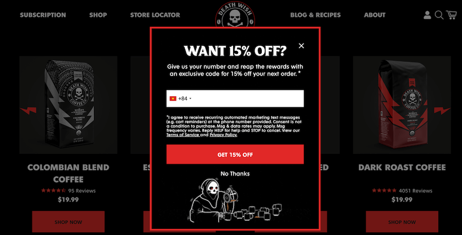
Death Wish Coffee is a popular coffee brand that has built its eCommerce store on Shopify. Their landing page is designed to grab the visitor’s attention and guide them towards making a purchase.
- Headline and Subheadline: The headline and subheadline of Death Wish Coffee’s landing page are attention-grabbing and clearly state what the brand is all about.
- Hero Image/Video: The hero image on Death Wish Coffee’s landing page is a high-quality image that showcases the brand’s products. The image is clean and simple, and it’s easy to see the different products that the brand offers. Additionally, the image is optimized for fast loading, which is crucial for keeping visitors on the page.
- Social Proof and Trust Signals: Death Wish Coffee’s landing page features social proof in the form of customer reviews. The reviews are prominently displayed on the page, and they provide visitors with an unbiased perspective on the brand’s products. Additionally, the page includes trust signals such as secure payment icons and a guarantee of satisfaction, which help build trust with the visitor.
9. Native
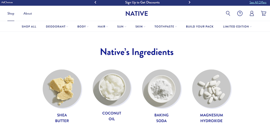
Native is a popular personal care brand that has an eCommerce store built on Shopify. These are some important features why it attracts and engages visitors.
Headline and Subheadline
The headline and subheadline of Native’s landing page are attention-grabbing and clearly state what the brand is all about. The headline reads, “Simple, Effective, Natural” and the sub headline reads, “Aluminum-Free Deodorant That Works.” These two elements work together to convey the brand’s unique selling proposition and establish trust with the visitor.
Hero Image or Video
The hero image on Native’s landing page is a high-quality image that showcases the brand’s products. The image is clean and simple, and it’s easy to see the different products that the brand offers. Additionally, the image is optimized for fast loading, which is crucial for keeping visitors on the page.
Product Showcase
Native’s landing page showcases the brand’s products in a clear and organized manner. The products are displayed in a grid format, and visitors can easily click on each product to learn more about it. Additionally, the product descriptions are concise and to the point, which helps visitors make informed purchasing decisions.
Footer
The footer on Native’s landing page includes links to different sections of the site, as well as links to the brand’s social media profiles. Additionally, the footer includes a sign-up form for the brand’s newsletter, which helps build a relationship with the visitor.
10. Harry’s
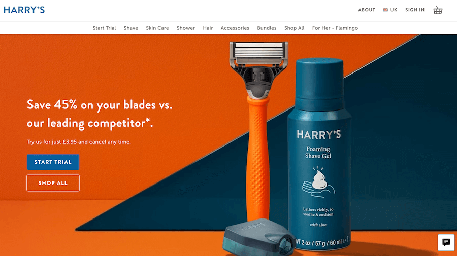
Harry’s is a men’s grooming brand that offers a range of razors, blades, and other grooming products. The brand is known for its sleek, minimalist design, and the Harry’s Shopify landing page is a great example of this.
- High-quality photos & images: The hero image on Harry’s landing page is a high-quality photo of the product. The image showcases the razor handle, blades, and shaving cream in a visually appealing way. The image helps the visitor to visualize the product and its benefits, leading to an increased likelihood of conversion.
- Social Proof and Trust Signals: Harry’s includes a section on their landing page that showcases social proof and trust signals. This section includes customer reviews, which are an effective way to build trust and credibility with potential customers. The reviews are presented in a visually appealing way and are accompanied by high-quality images of the reviewers.
- SEO Elements: Harry’s landing page includes several important SEO elements, including meta tags, a well-structured URL, and keyword-rich content. The page is optimized for search engines, making it easier for potential customers to find Harry’s products online.
- Loading Speed: Harry’s landing page loads quickly, which is important for user experience and SEO. The page is optimized for speed and includes compressed images and other optimizations to reduce loading times.
11. Simple Health
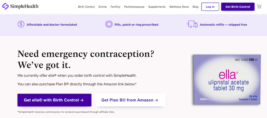
The Simple Health landing page is a crucial element of any online business that sells health-related products or services. Shopify provides businesses with an easy-to-use platform to create their online store and landing pages, allowing them to reach their target audience and increase sales. The Simple health landing page should be designed to effectively communicate the benefits of the product or service, build trust with potential customers, and encourage them to take action.
- Headline: The headline is the first thing that visitors will see when they land on the Simple health landing page. It should be clear, concise, and attention-grabbing. The headline should be focused on the benefits of the product or service and should be written in a way that resonates with the target audience.
- Product Features: The product features section should be used to highlight the key features and benefits of the product or service. This section should be presented in a visually appealing way and should include high-quality images and clear descriptions of each feature.
- Testimonials: Testimonials from satisfied customers can be a powerful tool for building trust with potential customers. The Simple health landing page should include testimonials from satisfied customers, along with their names and photos, to provide social proof and increase credibility.
- Contact Information: The contact information section should be easy to find and should include all the relevant information, such as phone number, email address, and physical address. This section can also include a map to help visitors find the business’s location.
12. Brooklin
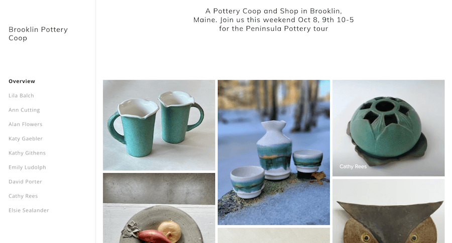
The Brooklin landing page is a Shopify-powered platform designed to help businesses create a strong online presence. It is an effective tool for businesses looking to showcase their products or services, engage with their target audience, and ultimately drive sales. With its customizable layout, mobile optimization, easy navigation, built-in analytics, and SEO optimization features, the Brooklin landing page provides businesses with everything they need to create a successful online presence.
- Customizable Layout: The Brooklin landing page offers businesses the ability to customize the layout of their landing page. This means that businesses can choose the design elements that best reflect their brand and effectively communicate their message to their target audience.
- Mobile Optimization: The Brooklin landing page is optimized for mobile devices, ensuring that businesses can reach their target audience regardless of the device they are using. This feature is critical in today’s mobile-first world, where more and more people are using their smartphones and tablets to browse the web.
- Easy Navigation: The Brooklin landing page is designed to be easy to navigate, with a clear hierarchy of information and intuitive navigation menus. This feature helps visitors find the information they need quickly and efficiently, leading to a better user experience and increased engagement.
- Fast Loading Times: The Brooklin landing page is designed to load quickly, ensuring that visitors do not have to wait long to access the information they need. This feature is critical in today’s fast-paced digital world, where visitors have little patience for slow-loading websites.
Conclusion
In conclusion, optimizing your Shopify landing page is essential for achieving success in the competitive world of e-commerce. By following the examples outlined in this article, you can create a landing page that is both visually appealing and effective in driving conversions. Remember to focus on key elements such as mobile optimization, clear messaging, easy navigation, social proof, as well as utilizing analytics to continuously improve your landing page over time. By putting in the effort to optimize your landing page, you can create a strong online presence that drives sales and helps your business grow.
This really answered my problem, thanks!